


Lynn Malone
When it comes to using colour, most people will prefer to err on the side of caution and stick to the tried and tested neutral palettes. For interior designer Lynn Malone, working with bold colours is easy as long as one sticks to a few rules. Lynn shares that the secret to using colour is not to get too carried away with too many colours, finishes or materials.
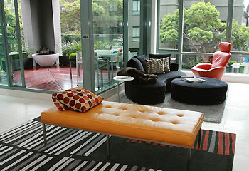
"When you have colourful artworks and furnishings, a neutral backdrop sets the stage for the artwork. It also celebrates the open spaces," Malone says. "And neutral doesn't equate to dull. A neutral colour palette may be indigo blue, deep chocolate or khaki."
For her own apartment recently featured in HomeBeautiful June 07 (Australia), the white and dark charcoal backdrop puts the spotlight on the designer's furniture collection. The soft curves of her furniture also serve to juxtapose the angular architectural elements of the interior.
Click here for more useful design tips by Malone


No comments:
Post a Comment